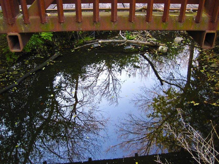
Those who know me also know I’ve used the phrase “It Could be Anywhere” in reference to where I fish here in the northeast corner of Illinois. Even in this urban area I like to think I have a knack for finding the hidden gems, the out of the way places where, when looking at the photos, you would never guess you were on the edge of a population center with nearly 10 million people.
I’m in the process of going through thousands of photos I’ve taken over the years. Some of them aren’t half bad. I’m hoping to get them all up on a gallery site I’ve started putting together. Would be nice to offer the best ones for sale. Will be manipulating still other images, turning them into my image of artwork and offering those for sale too.
But, before I go any further, I’d like some feedback. There’s no point doing a ton of work if the site is ugly, unreadable, clumsy and a whole list of other possible issues.
Right now, I like to think I’ve adjusted type sizes and colors to make them easy to read. In other words, I’m not squinting at the screen, have to put on my reading glasses or getting a headache. I know what I can’t read when I go to other sites, so I’ve tried to eliminate those issues right from the start. Click on the link below and let me know what you think.
I haven’t put up much in the way of images, just test pieces in the first 3 galleries. The sizes seem good, what little type I’ll be putting in is readable. I know most images are best viewed on dark backgrounds so not sure I would change that unless I get a lot of complaints on it.
Feedback is appreciated. The hard part is yet to come, but if I can get this style stuff out of the way, I can quit thinking about it and move on.
Thanks in advance.

Dave Price
24 Feb 2012Hey buddy, keep going with this! I really like the look of the site, its very readable, and the pictures are outstanding!
Ken G
24 Feb 2012Thanks Dave. I’ve got a lot of work ahead of me yet and 12 years of photos to go through, at least. Daunting task. Been sitting on this stuff too long.
Larry Granat
24 Feb 2012Very nice so far Ken! I love the look. I don’t know anything about websites but it has a good feel. Now I’m looking forward to a lot more content.
Ken G
24 Feb 2012As long as it’s readable Larry and not giving you a headache, I’m on the right track.
Lots of content to go through and manipulate. It’s overdue.
Pam
24 Feb 2012I’ve already subscribed! Love the way it’s looking so far. With your eye I’m sure it’ll be great.
Ken G
25 Feb 2012Thanks Pam. Hardest thing to get used to is how the whole Gallery add on to WordPress functions. Everytime I think I have it down, it proves me wrong. I’ll get used to it, soon, I hope. Want to get it down to a routine so I can focus on the pretty pictures.